Google updates the Play Store periodically, but the changes are usually subtle. A recent server-side update, however, is shaking things up quite a bit.
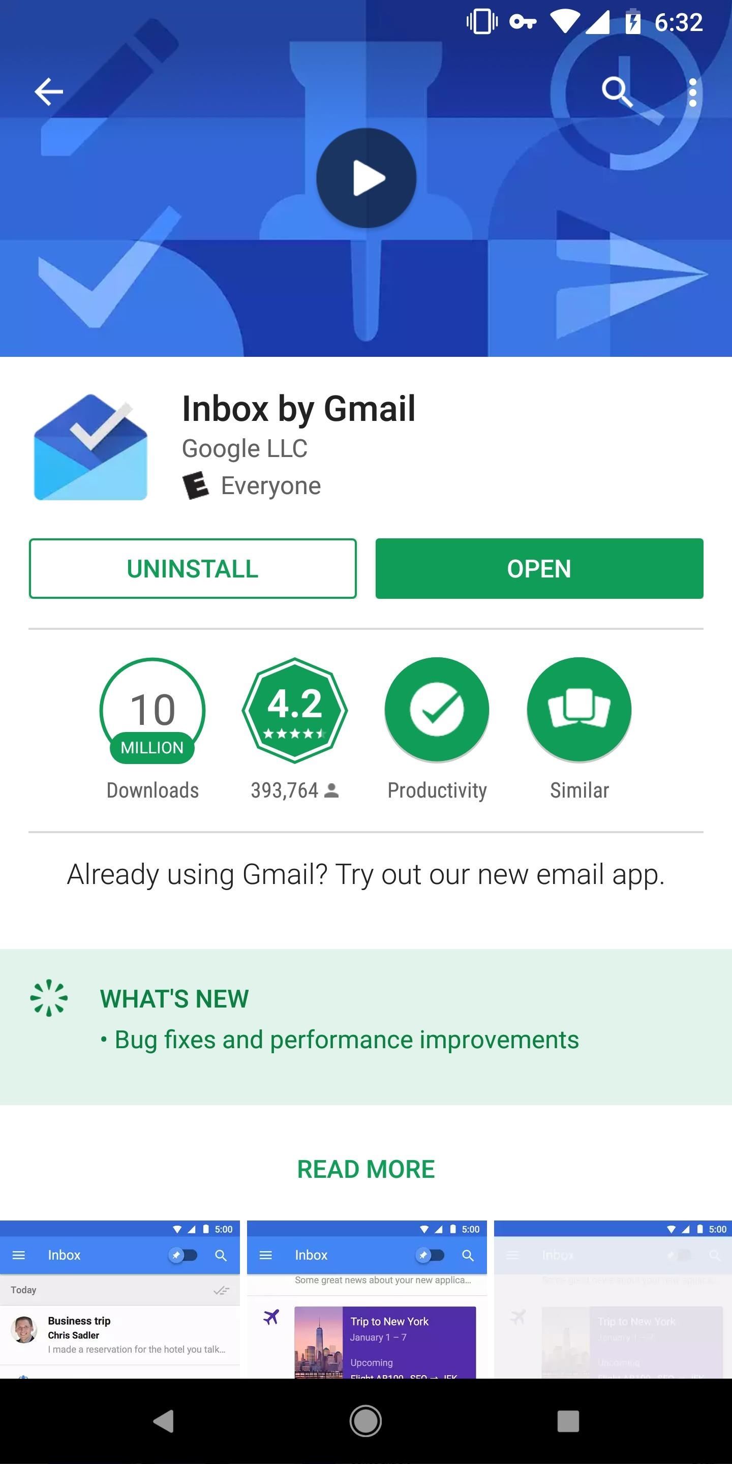
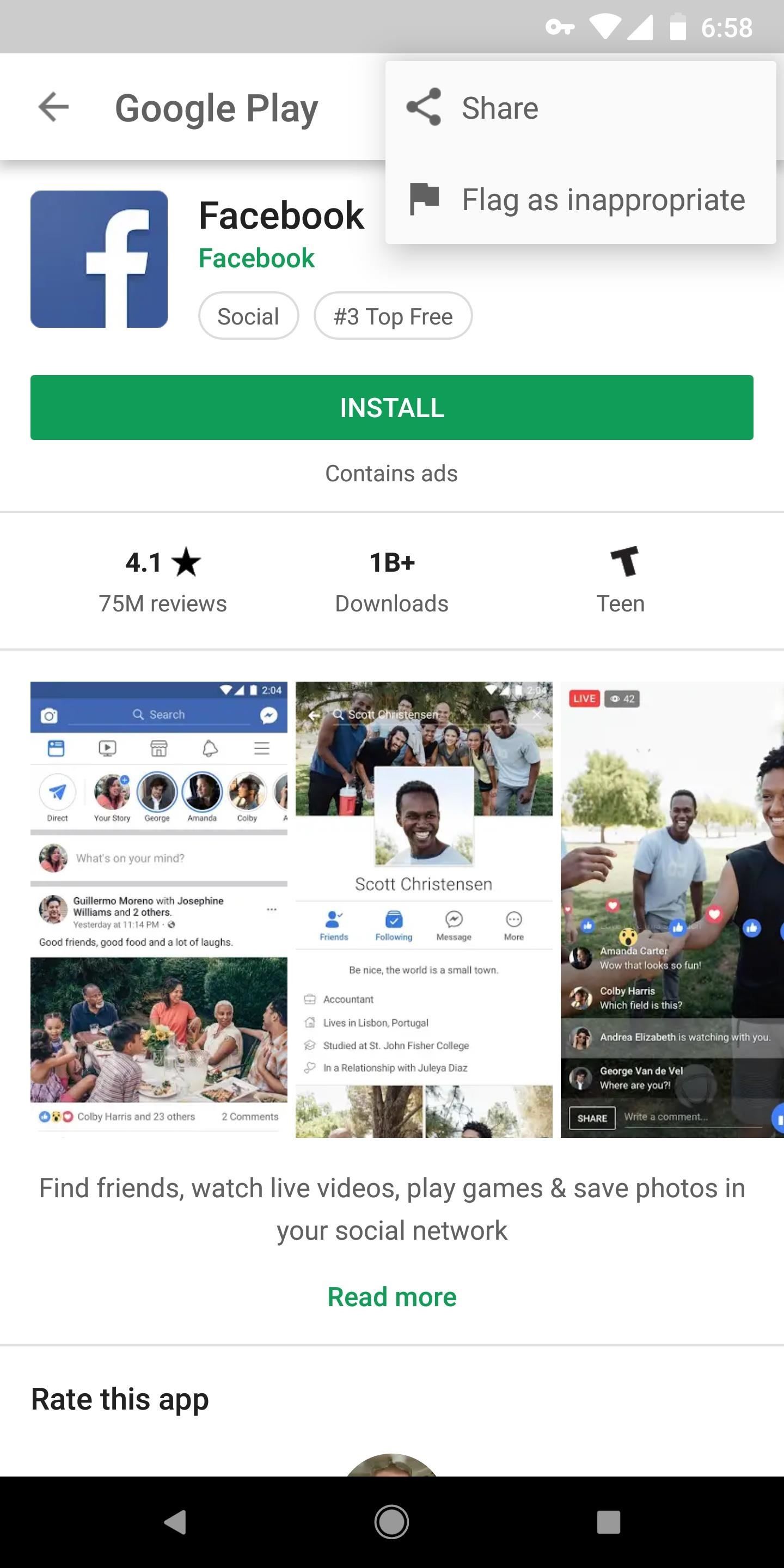
In past versions, app installation pages have had images or videos at the top of the page to give app developers a chance to set themselves apart. The new redesign, which appears to be rolling out to only a limited set of users for the time being, makes these pages a lot more uniform.
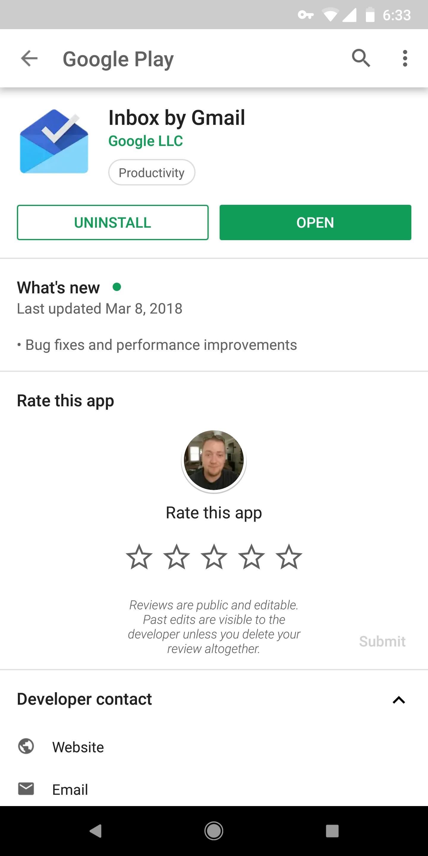
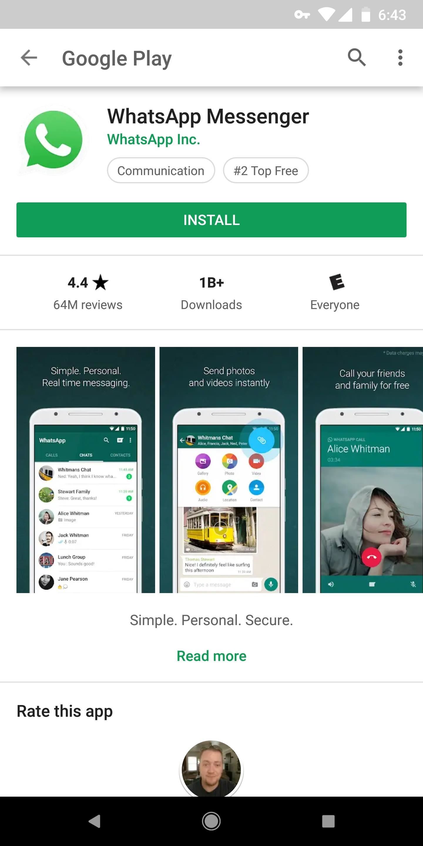
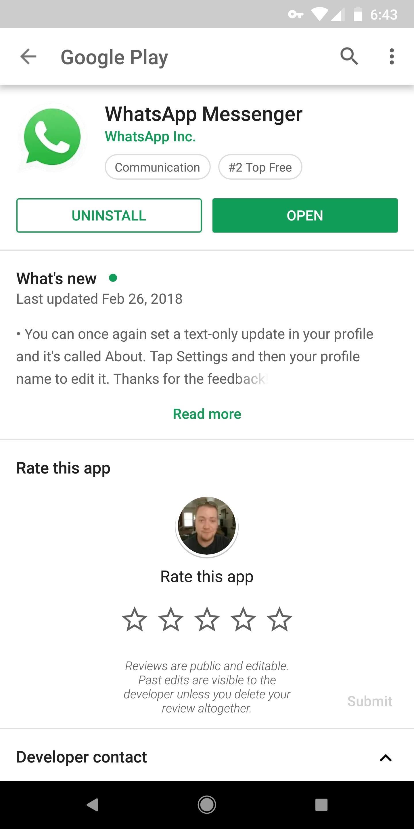
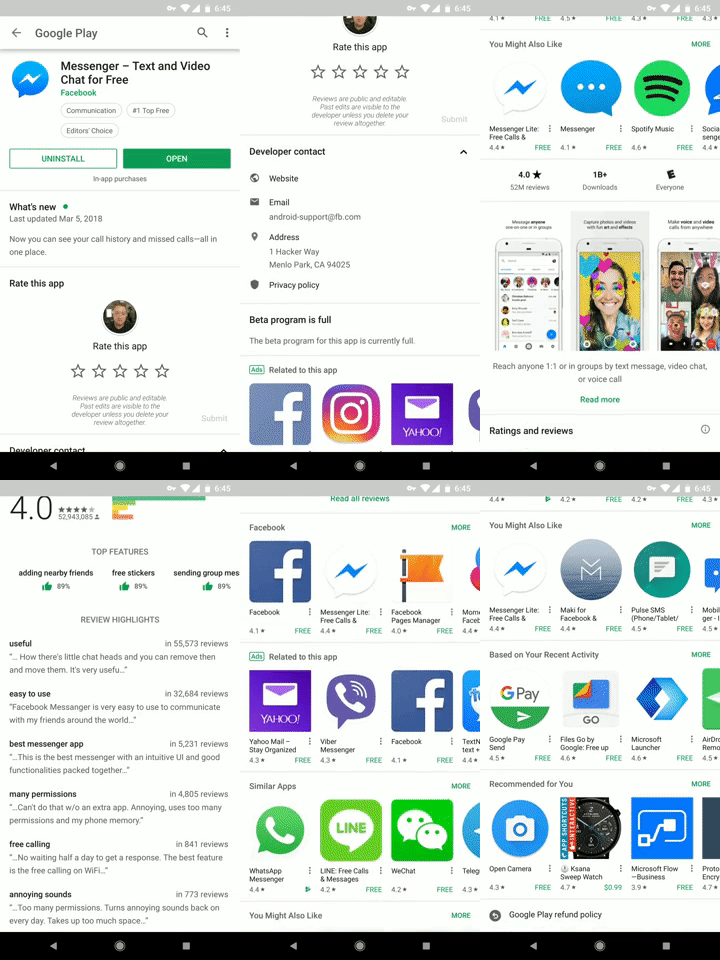
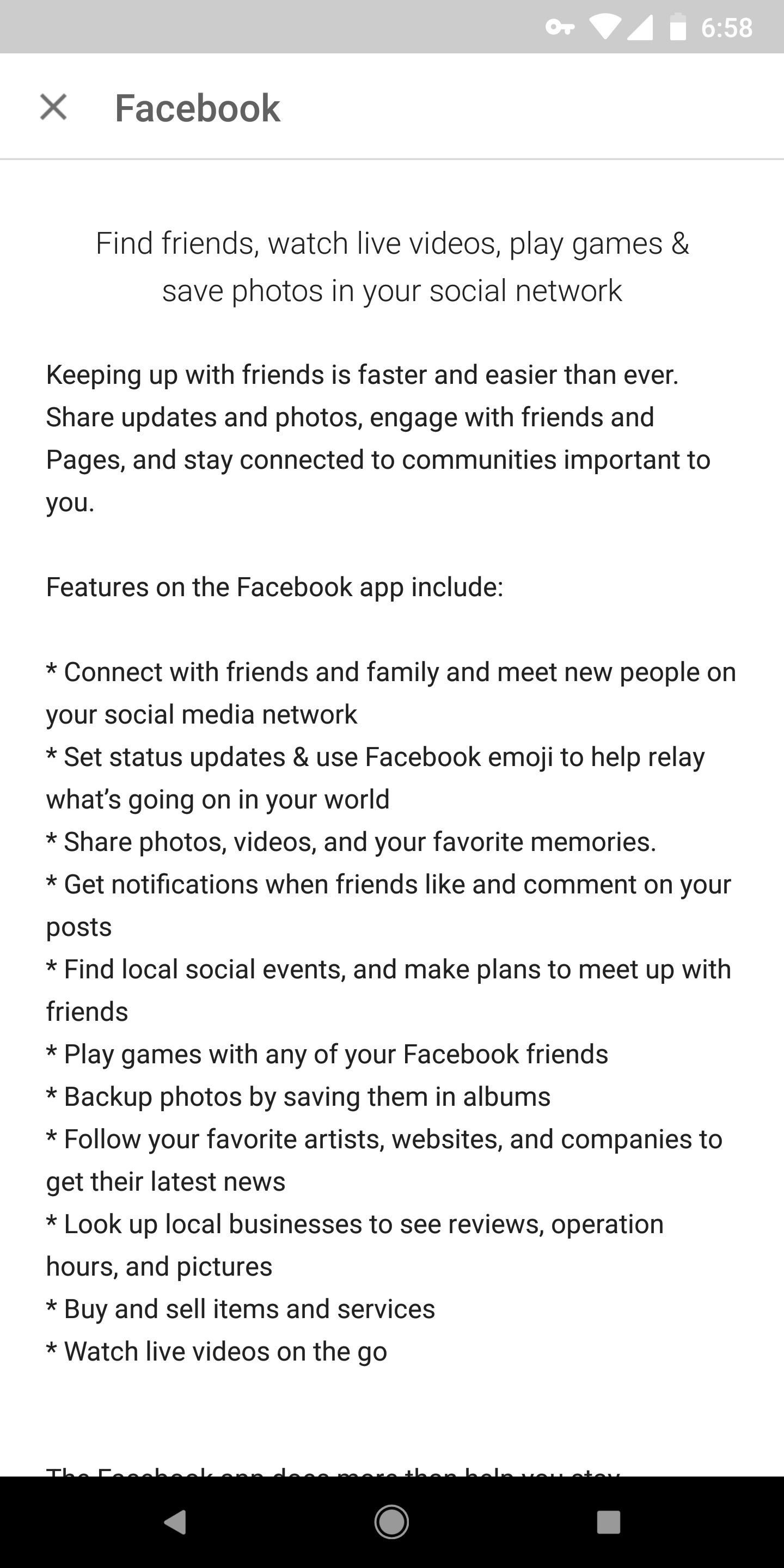
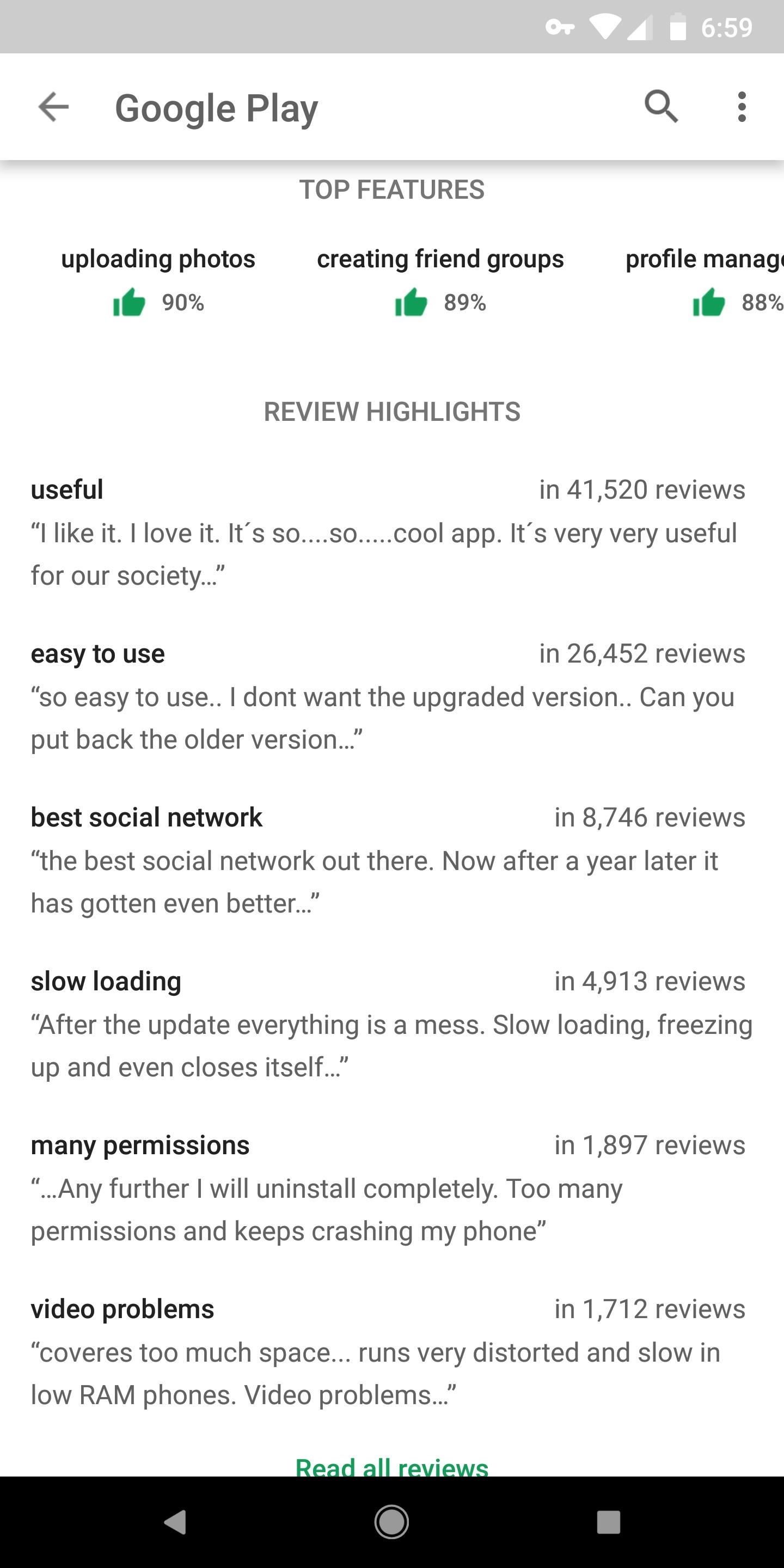
Interestingly, app listings now display information differently depending on whether or not you've installed the app. Before you install an application, videos, screenshots, app descriptions, and user reviews are at the top. But after you've installed the app, the "What's New" section comes first, followed by a card inviting you to rate the app and developer contact info.
This "reactive" design attempts to highlight the information you might need at a given time. Before installing an app, you'll be able to read up on it and view screenshots. After installing the app, it's now easier to see changelogs, rate the app, or contact the developer if you have any issues.
Aside from the reordering, the biggest change is the action bar at the top of the screen. Instead of the visually-rich media headers of past Play Store revisions, it's now a plain white bar with a search button, back arrow, and overflow menu. The "Install" button is significantly bigger now as well, perhaps in an attempt to draw your eye and get you to pull the trigger on installing the app.
In all, it's a fairly radical redesign as far as these things go. There's no word on when this new design will hit the masses, but it appears to be a server-side update, so it's just a matter of waiting. The rest of the Play Store remains unchanged, but you can see more of the app listing redesign in the screenshot gallery below.





![Movies Anywhere merges flicks from iTunes, Play, Amazon, and Vudu into a single library [Update]](https://blogger.googleusercontent.com/img/b/R29vZ2xl/AVvXsEigKqdrcZDyHHhTqMof4EDYS3r1RTVxk6pt3cplmQHfPqNMz69YCanR46LC4b0xTr-wNYnJxIyoJUwYOGvvz5zrcAfcWSMNP-28wUDsLFbcPWtceEGv09D-BR3k79x8_ZQIBtir834p6U4/s72-c/Screen-Shot-2017-10-11-at-7.34.53-PM-796x422.png)

No comments:
Post a Comment